
Product Feature
More control, less overwhelm
An addons experience that helped users configure personalization with confidence.
Role
Lead Product Designer
Duration
4 months
Team
Product, Design, Engineering, Data
Overview
Twik offered powerful personalization capabilities, but the control layer wasn't working for most users.
Power users felt limited, while newer users were overwhelmed by the interface. The same system needed to serve both without becoming either too complex or too restrictive.
I led the redesign of the addons experience to make advanced control feel more approachable, understandable, and safe to use, without removing depth.
Product Context
Twik is a personalization platform that allows e-commerce teams to configure how their site adapts to different users.
Addons were a key part of that system, giving users more control over behavior and customization. But as the number of options grew, the experience became harder to navigate and harder to trust.
The Problem
The interface exposed too much complexity too early.
Users were expected to configure advanced behavior without enough context, feedback, or confidence. This created friction for new users, while still not fully satisfying more advanced ones.
The system technically allowed control, but didn't make that control feel usable.
Why It Mattered
This created a gap between capability and adoption.
- New users avoided addons because they felt risky or unclear
- Power users didn't feel they had enough structured control
- Feature usage remained lower than expected
- Revenue tied to addon usage was limited
The product had the right capabilities, but the experience was holding them back.
Goals
What I Did
- Mapped different user types and how they approach configuration (new vs advanced users)
- Identified where users lost confidence or hesitated to act
- Introduced progressive disclosure to control how complexity is revealed
- Reframed controls visually instead of relying only on configuration panels
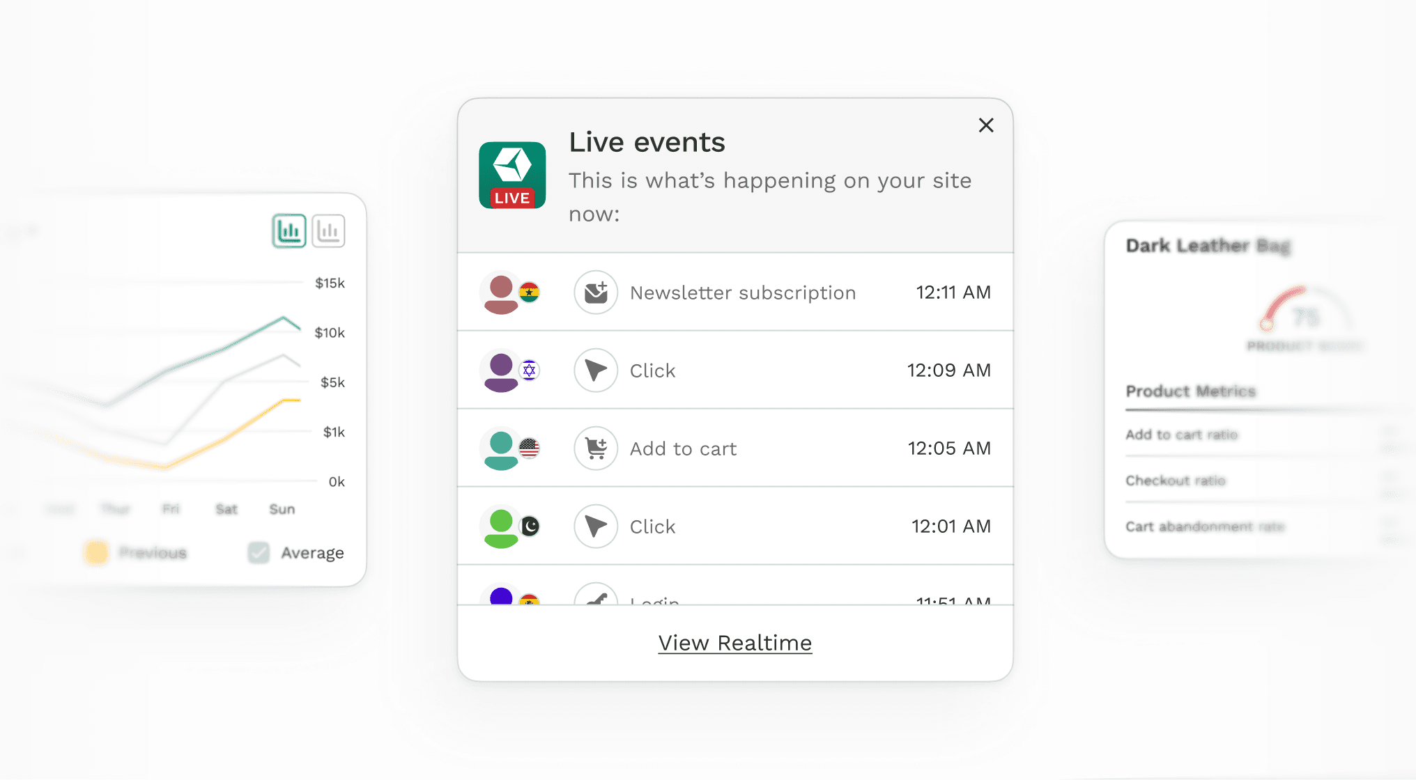
- Designed real-time preview to make changes feel immediate and reversible
- Added contextual guidance and inline education where users needed clarity
- Implemented undo/redo to reduce fear of making mistakes
Key Insight
Users didn't just want more control.
They wanted to feel in control.
The issue wasn't a lack of features. It was a lack of confidence in using them.
Key Decision
The most important decision was to separate depth from exposure.
Instead of showing everything upfront, I designed the system so users could start simple and go deeper when needed. Advanced options remained accessible, but were introduced progressively.
This allowed the product to serve both cautious users and experienced ones without forcing a single interaction model.
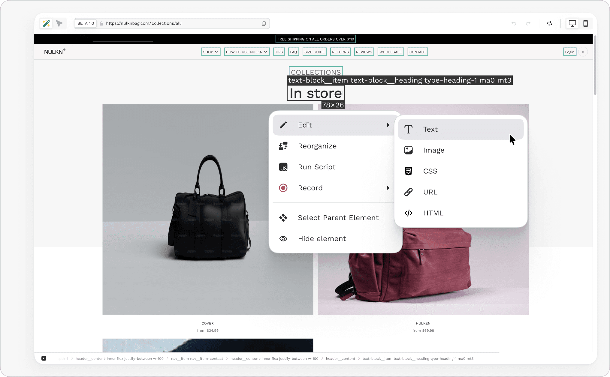
The Solution
The redesigned addons experience focused on clarity, feedback, and control.
Key improvements included:
The goal was not to reduce power, but to make it easier to access and trust.
Outcomes
Feature Adoption
Users trying addons
Revenue Impact
Addon-driven growth
NPS Score
Points improvement
Daily Active Use
Regular feature usage
What I Learned
Giving users more power doesn't automatically improve the product.
Power needs to be structured, explained, and introduced at the right moment.
The best solutions often come from reducing cognitive load without removing capability.
Gallery